
Blood Pressure Health Guide
Omnichannel Blood Pressure Education + Tracking
Product Design - Kiosk UI - Mobile - Usability Testing - Workshops - Leadership
Project Overview
The Higi Product team collaborated with the American Heart Association (AHA) to transform a Blood Pressure management care guide into a consumer-friendly digital experience.
Project Outcomes
Changed perception of the Kiosk from "just a blood pressure station” to a way to help people manage and maintain health blood pressure.
Onboarded 15,000 people into the health program in the first month
Project Goals
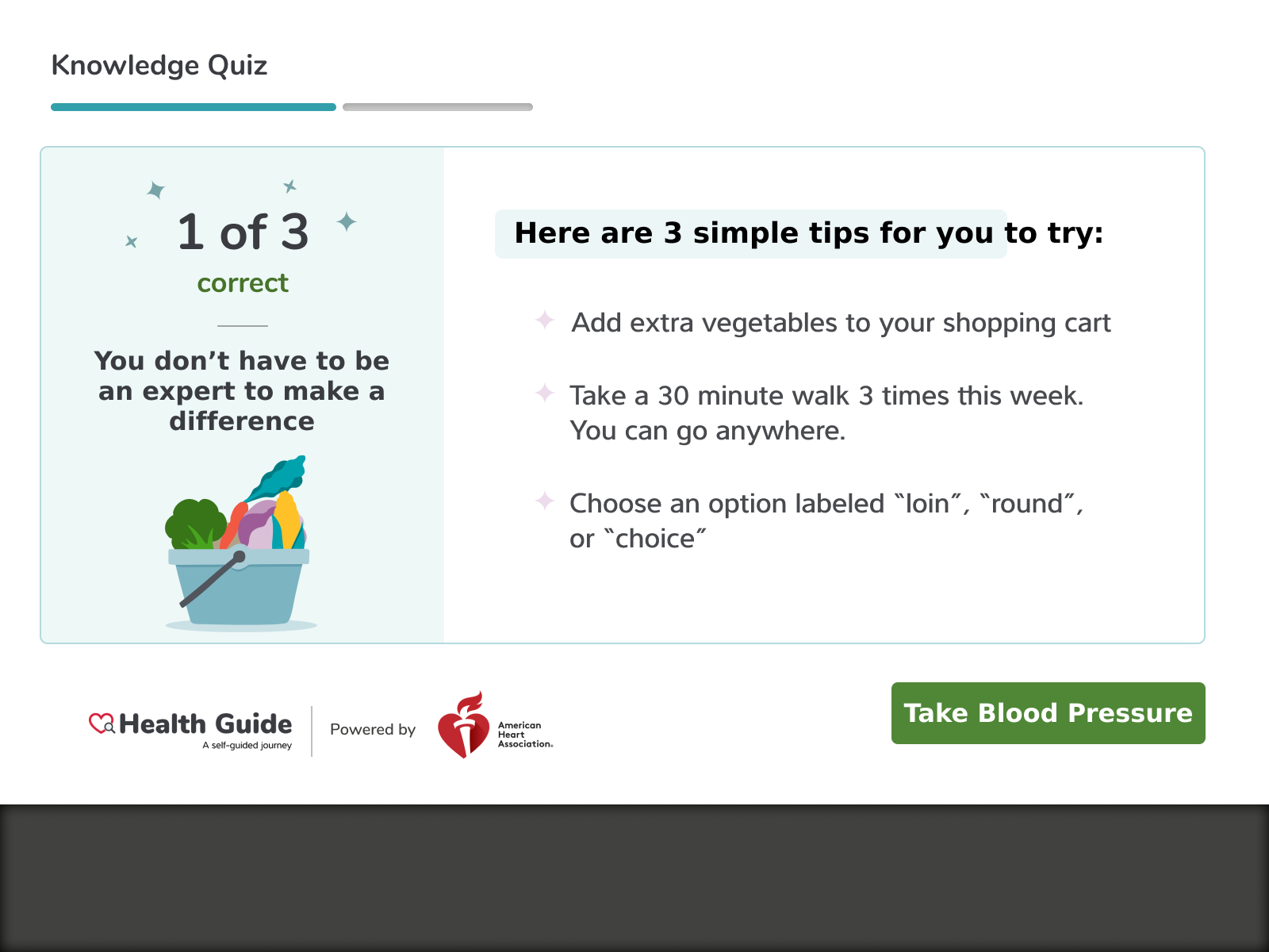
Personalized education and actions to take based on a healthy habit
Uncover barriers to blood pressure control and actions to overcome those barriers
Deeper insights into blood pressure trends
My Role
I worked as Lead Product Designer alongside a Product Designer. I helped develop design direction, worked closely with product and engineering, and coached junior designers through design iterations.
Background
To better support people with high blood pressure, our team worked in conjunction with the America Heart Association (AHA) to develop an interactive “Health Guide” that slowly introduces lifestyle changes people can make to help lower and maintain healthy blood pressure.
Challenges
Taking a guide meant for 1 to 1 and scale to 1 to many
Transforming user perception of the station as “just a blood pressure station” to a “health management system”

Existing Content for Health Guide
Higi worked in partnership with the American Heart Association to take their paper system usually used by clinical workers and transform it into a digital experience that is both accessible and educational.
How might we make health education easy and accessible?
— How Might We statement
Helping People Be Their Healthiest
Convenient healthcare focused on healthy lifestyle changes
We teamed up with the American Heart Association to transform a care program originally designed for a direct clinician to patient care, to a program that can reach many.

6 Areas of Healthy Habits
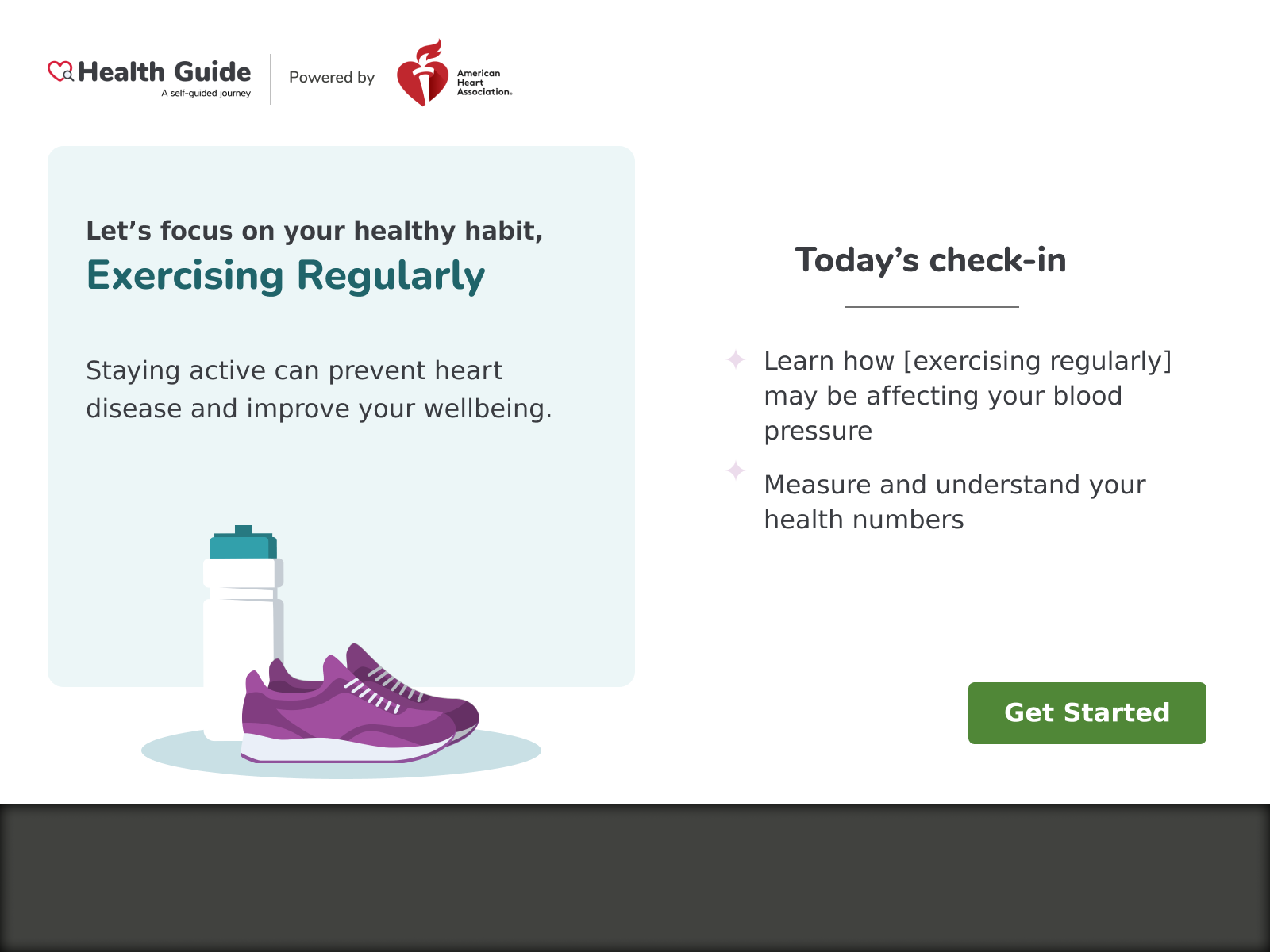
Lifestyle changes can have huge impacts on overall health. Our team focused on 6 major areas for people to focus on and broke the content into bite sized pieces.

Health Check-ins
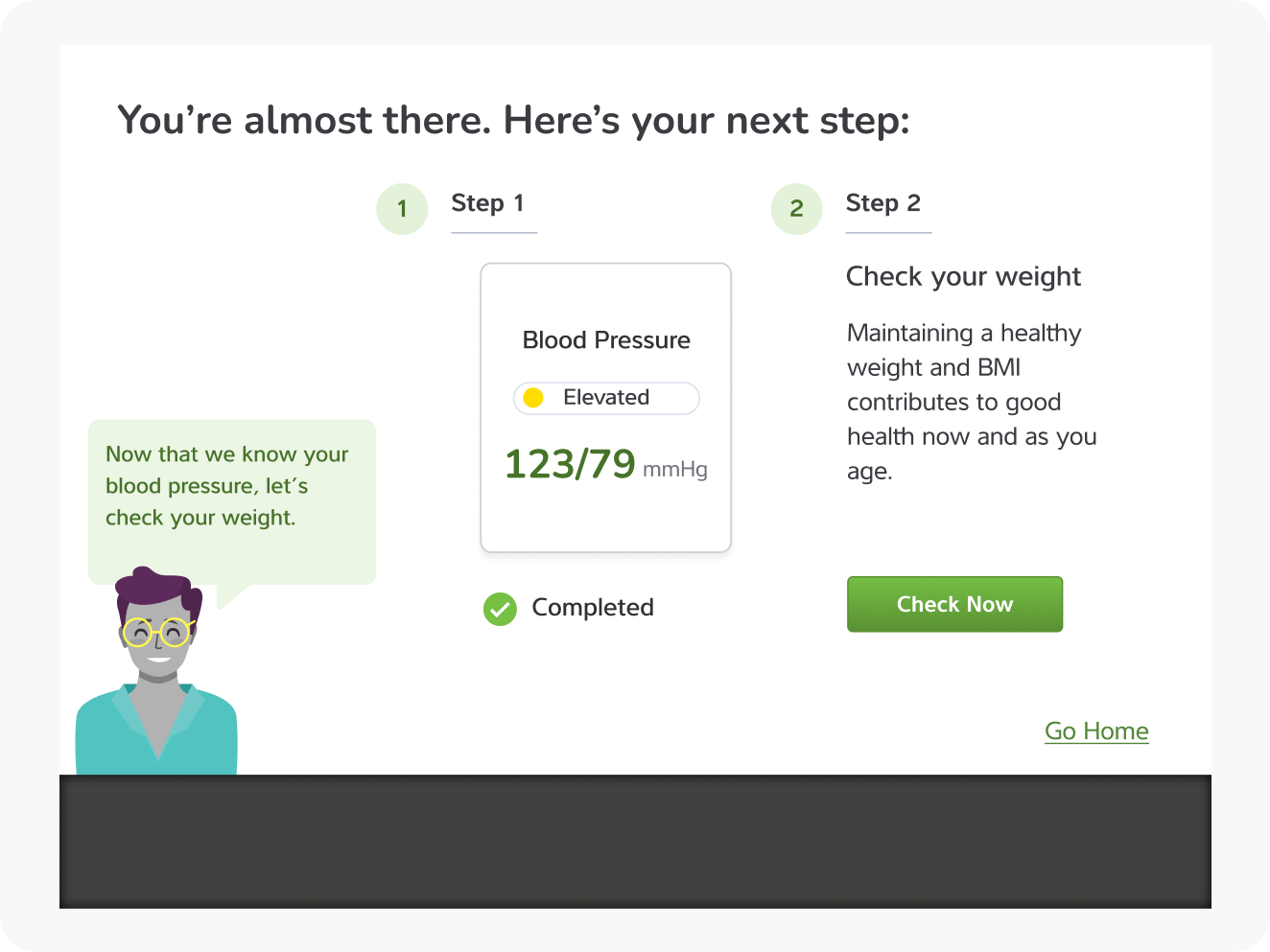
Part of a healthy routine is regularly checking in on important health numbers like weight and blood pressure. Our team designed a 2x monthly check-in process to help people keep tabs on their health

Target audience
Our team developed 4 basic user types based on persona types developed by the AHA and user research conducted by our team. These user types mostly informed the tone and frequency of content given to users over time.

Journey Workshop
One of the most helpful activities we did was a future state journey map to understand how the mobile application fit into the larger ecosystem of the Higi’s health management. The team developed 2 user journey maps for the 2 different persona types. The workshop was conducted remotely using Miro.

“Our team now has a vision for what this experience will be for people. The workshop was really helpful for getting us there. ”
— Product Manager
Design
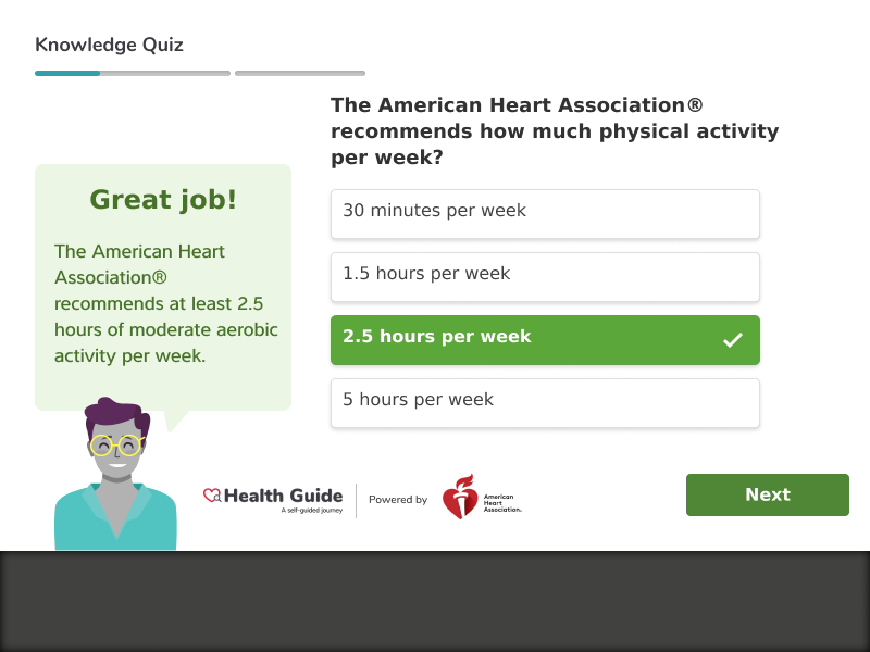
Health Quiz
To build knowledge about health blood pressure, the team decided to present information in the form of a short quiz with a conversational tone between user and system.


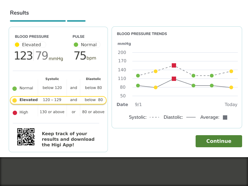
Blood Pressure Trends
In order to help users see their trending data, the team incorporated blood pressure data visualization into the Kiosk experience. The goal was to provide more context for the user when it came to their health numbers. In order to keep a seamless, consistent user experience, the kiosk experience closely matches the mobile experience.


Home Screen Redesign
The current home screen provided too many options for users to take, resulting in decision paralysis. Our team reimagined a guided experience that personalized the user’s first step on the Smart Health Station


Previous home screen
User Flow

User Research
Concept and Usability Testing
Before launch, I recruited 6 participants to take a test run with the Health Guide to understand initial impressions, perceived value of the program and uncover any areas of confusion or usability issues. Our team was able to quickly iterate on changes before launching on the 10,000 stations.
Key areas to explore:
Do people find value in the Health Guide, if any?
Were there any areas of confusion around the health guide check-in process?
Are there any areas of opportunity to improve the Health Guide experience?
Excerpts from Usability Findings Report
Key findings
Most people saw the Health Guide as a more personalized version of their current experience
The program was highly credible in part because of the partnership and branding of the AHA.
Some users were unclear about what the expectations of “check-in” were and when the check-in was complete.
Participants overwhelmingly expected more personalized suggestions based on ability, age, and health literacy and tangible health goals.


